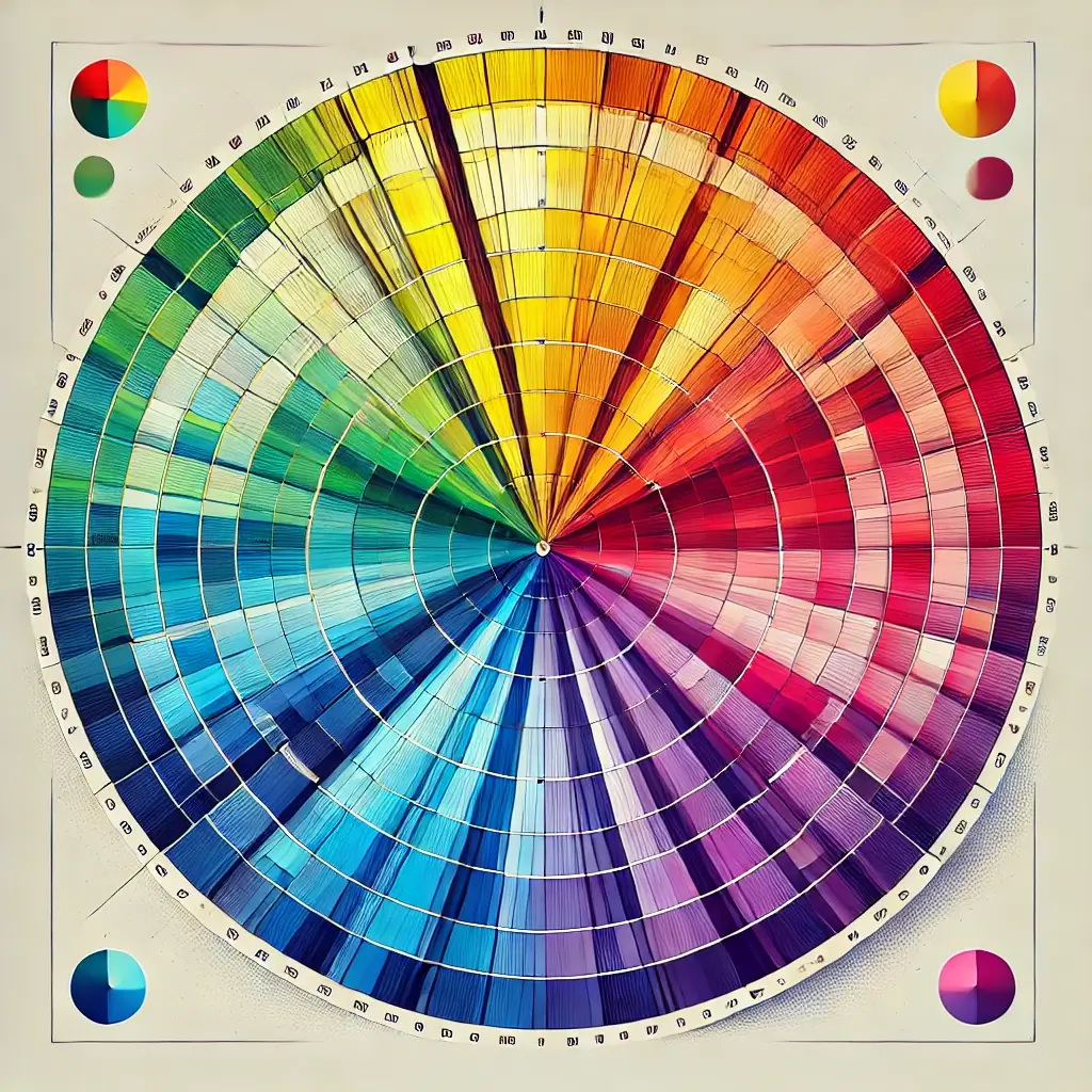
The color wheel is a fundamental tool in understanding how different colors relate to each other. It is a visual representation of the relationships between primary, secondary, and tertiary colors. The primary colors—red, yellow, and blue—are positioned equidistant from each other on the wheel, with secondary colors—green, orange, and purple—forming between them. Tertiary colors are a mix of primary and secondary colors, filling in the gaps.
By using the color wheel, designers, artists, and decorators can easily create harmonious color schemes. Whether you are looking to design a space with complementary colors, analogous colors, or triadic schemes, the color wheel provides the guidance you need. Mastering the color wheel allows for endless creative possibilities, transforming spaces with the perfect balance of shades and tones.
History of the Color Wheel
The concept of the color wheel dates back to the 17th century when Sir Isaac Newton first mapped out the spectrum of visible light into a circular diagram. His work laid the foundation for modern color theory. Over time, the color wheel was developed further by various artists and scientists, such as Johannes Itten and Josef Albers, who used the wheel to explore color harmony, contrast, and the emotional effects of colors.
Today, the color wheel remains an essential tool in various fields, from art and design to fashion and interior decoration. Understanding the historical evolution of the color wheel can deepen one’s appreciation of its role in creating balanced, aesthetically pleasing color palettes. Whether you are a beginner or a professional, the color wheel provides a roadmap for experimenting with different color combinations.
Exercises to Master the Color Wheel
To fully understand the color wheel, try the following exercises:
Create Complementary Color Schemes: Choose two colors that are opposite each other on the color wheel (e.g., red and green) and use them to design a room or artwork. Solution: Combining complementary colors often creates vibrant and energetic visuals.
Experiment with Analogous Colors: Select three colors that are next to each other on the wheel (e.g., blue, green, and yellow-green) and apply them to a design project. Solution: Analogous colors create harmonious and pleasing designs that feel natural.
Mix Primary Colors: Use red, yellow, and blue to create secondary and tertiary colors, observing how the combinations affect the overall design. Solution: Mixing primary colors results in secondary colors (green, orange, purple) and can be layered to create various tertiary shades.
Create a Monochromatic Scheme: Choose a single color and use different shades, tints, and tones of that color in your design. Solution: Monochromatic schemes offer a cohesive and elegant feel, suitable for minimalist designs.
Warm vs. Cool Colors: Create two designs—one using warm colors (reds, oranges, yellows) and the other using cool colors (blues, greens, purples). Solution: Warm colors evoke energy and closeness, while cool colors bring calm and relaxation to spaces.
These exercises will help you gain a deeper understanding of how different colors interact and how to apply them in creative contexts.
Use Cases for the Color Wheel in Design
The color wheel is widely used in different fields of design. Here are three key areas where it plays a significant role:
Interior Design and Decoration: The color wheel helps interior designers choose color schemes that create the desired atmosphere in a room. Complementary colors can add energy, while analogous colors create balance and harmony. Designers often use the color wheel to match wall colors, furniture, and decorative elements to achieve cohesive and aesthetically pleasing spaces.
Industrial Design: Industrial designers use the color wheel when designing products to ensure that the colors used are not only functional but also appealing to consumers. From the packaging to the product itself, understanding color harmony helps to create designs that attract attention, evoke emotions, and convey brand identity.
Building Architecture: Architects use the color wheel to design exteriors and interiors of buildings that blend with the environment or stand out in a dynamic way. They carefully select color schemes that enhance the architectural features of a building, considering factors like natural lighting and the surrounding landscape.
The color wheel offers valuable guidance in each of these fields, helping professionals make informed decisions about color in their work.